
Logos and Brand
The Second-Ponce logo tells a story, and we’re proud to share that story with you. Download our logos, get color and font information and read how our whole visual identity came together.

Our Brand Story
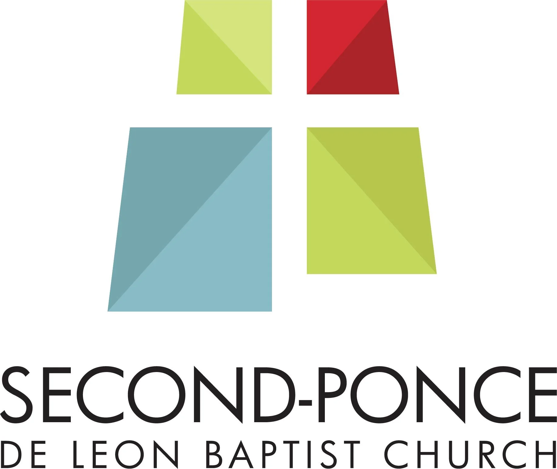
We are a warm fellowship of Christ-followers from all walks of life who desire authentic relationships with God and with each other. We want our logo to reflect that.
The 4 quadrants represent our 4 core values of worship, community, mission & discipleship.
The white space in the middle has a double meaning: First, it depicts the cross, metaphorical space at our church’s core that can only be filled by Christ. Additionally, the space creates an intersection representing our church’s literal location at the corner of Peachtree and East Wesley.
The shading of each quadrant gives the logo movement to illustrate our energy and vibrancy. It also suggests that we welcome differences within our sameness as children of God.
Church Logos


Logo Colors
-

CMYK: 46%, 13%, 20%, 0%
RGB: 136, 187, 197
HEX: 88BBC5
Pantone: 551C
-

CMYK: 56%, 21%, 29%, 0%
RGB: 117, 168, 175
HEX: 75A8AF
Pantone: 2177C
-

CMYK: 11%, 99%, 91%, 2%
RGB: 210, 38, 48
HEX: D22630
Pantone: 7620C
-

CMYK: 22%, 99%, 95%, 15%
RGB: 171, 35, 40
HEX: AB2328
Pantone: 7622C
-

CMYK: 19, 0, 65, 0
RGB: 213, 228, 125
HEX: D5E47D
Pantone: 7492U
-

CMYK: 27%, 1%, 81%, 0%
RGB: 195, 216, 92
HEX: C3D85C
Pantone: 7744C
-

CMYK: 33%, 8%, 87%, 0%
RGB: 183, 198, 78
HEX: B7C64E
Pantone: 2302C
